

Creating those viral images of space is a painstaking process of science meets art. Here’s how the experts do it.
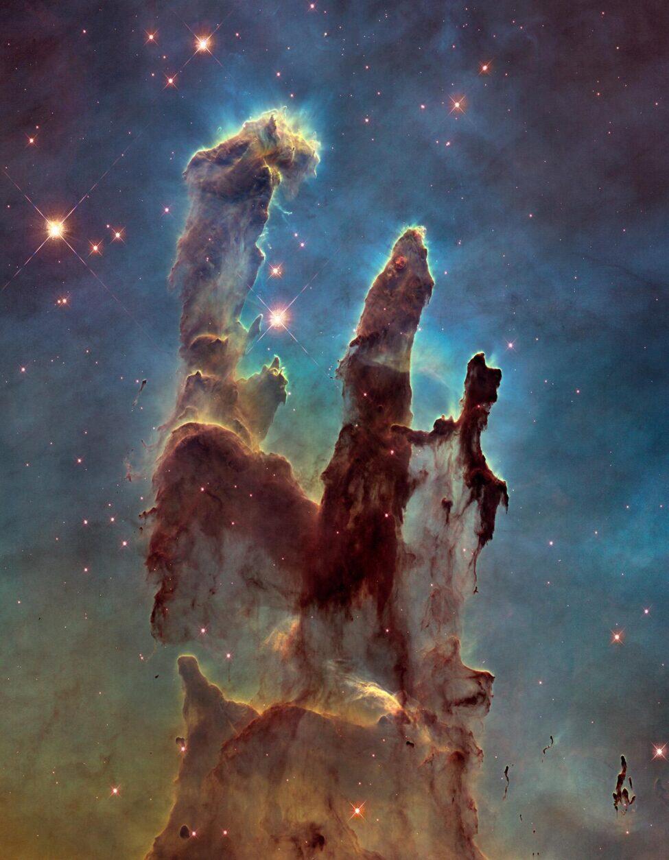
When most people imagine traveling to space, they picture breathtaking, colorful swirls or sparkly stars like the images shown on social media. Perhaps the iridescent Eagle Nebula’s Pillars of Creation or the Cosmic Cliffs in the Carina Nebula come to mind. But these images are not what space would actually look like if you could time-travel there. In fact, space would look pretty bland to you or me.
That’s right. Bland and boring. You’d probably see a mostly black, endless sky sprinkled with white stars. No colorful, psychedelic patterns. But, that doesn’t mean that those images are entirely fabricated. The reason involves a careful scientific and artistic process that transforms invisible light in space into visible wavelengths humans can see, helping drive public interest.
Our Eyes Are Limited
Space would look rather plain to us because the human eye can only see a narrow range of the electromagnetic spectrum, known as the visible light spectrum. The human eye is made of rods and cones, which decipher light and color. The cones are sensitive to red, green, or blue light, so all the colors we see are a mix of light from these cones. They can only detect wavelengths from 380 to 700 nanometers, which is just 0.0035% of the total spectrum. That means there are a lot of wavelengths the human eye can’t see because they lie outside of the visible light spectrum (radio waves, microwaves, and x-rays, for example), but telescopes and cameras can.
Continue Reading Article After Our Video
Recommended Fodor’s Video
Space telescopes like the Hubble and the James Webb are built to capture wavelengths far beyond the visible light spectrum. These wavelengths carry crucial scientific information about temperature, composition, motion, and age of celestial objects. For example, the hotter an object is, the shorter the wavelength, and the bluer an object appears. The colder the object, the more reddish it can look, because the wavelengths are longer.
When these telescopes capture the images, they are typically grayscale. These are called “true color” images, meaning they match what the human eye would see. Those colorful images of space made famous online are called “false color” images, meaning they were created using filters to make the invisible visible. However, the word “false” may be misleading–these images are scientifically accurate, and are used to learn about the contents of an image and increase public interest in astronomy.
The Art and Scientific Process
Creating those stunning space images involves multiple steps, beginning with careful planning and determination of what wavelengths to show. This is determined by what scientists want to learn from the image.
The James Webb telescope has a giant, 21-foot mirror inside that’s coated in gold, because gold reflects the infrared light very well. The mirror gathers light and reflects it into the telescope’s two instruments: the NIRCam and the MIRI. They detect different wavelengths. The light hits its sensors and goes through a filter wheel, where each filter represents a different wavelength.
“Let’s say you have 10 different filters that only let pass a different portion of the infrared light. Then you assign a complete rainbow of visible colors to each of the 10 filters to bring up that depth and that beautiful imagery,” says Macarena Garcia Marin, a project scientist in the Webb Mission Office. “So you would get 10 different images, one of them in each color. And then you convert that into actual colors.”
Once the scientists have the various filtered images, they stack them to create the beautiful images you’ve seen online.
Joseph Depasquale and Alyssa Pagan are science visuals developers in the Office of Public Outreach at the Space Telescope Science Institute, where they create astronomical images from the data received from Hubble and Webb for scientific use, news releases, and public outreach.
They take the data from the telescope and put it through pipeline processing, where they clean up the image, removing any spots that were reflected in the telescope and aren’t actually things in space, and compositing them to create a color image. The longest wavelengths are assigned shades of red, while the shorter wavelengths are green and then blue.
From there, their focus turns to aesthetics (while still maintaining scientific accuracy and focusing on the scientific message they want to convey through the image). They tackle color balance, white balance, and adhere to astrophotography best practices.
“We’re adhering to the data but we’re also thinking: ‘What are we trying to showcase? What are we trying to make sure that the audience understands?’ There’s a focus,” says Pagan. “We’re thinking about composition, the movement of the eye, how digestible this image is. Color contrast and color separation are very important in leading the eye and enhancing those details we’re getting from specific wavelengths because those wavelengths are capturing temperatures, compositions, et cetera. It’s telling part of the story.”
This process can take an hour for simpler images of a single comet, or weeks, depending on the size and complexity. Depasquale and Pagan worked on images of the Pillars of Creation and the Cosmic Cliffs–photos that show giant parts of space. The Pillars of Creation show five-light-year-tall structures of gas while the Cosmic Cliffs show a giant star birth. These large images require stitching together a mosaic.
“You have a lot more filters to work with and you have time to spend looking at those filters to make sure you’re utilizing the best ones. You’re not just taking all the filters and being like, I’m gonna use all of them willy-nilly and not thinking about how they stack with each other,” Pagan says. “Because it’s like mixing a bunch of paint–it can just turn brown.”
But sometimes, the images are not simply colored based on different wavelengths. If scientists want to show two distinct aspects of an image, for example, they may color one red and one blue, like color coding.
Peter Thomas is a Cornell University planetary geologist who worked on images, such as Saturn’s moons, looking at the measurement of shapes of objects, the color, and the brightness to determine the composition.
“It gets arbitrary. If you publish these things, you have to explain exactly which wavelengths have been done and why,” Thomas says. “Hopefully the people writing it will explain exactly why they have taken two wavelengths and made one blue and the other red to differentiate what they’re after. It’s a wonderful world of both art and very specific scientific presentations.”
What the Colors Can Show
These colorized images serve crucial scientific purposes. Different wavelengths reveal the presence of materials, distance, velocity, direction of movement, pressure, temperature, and more.
Dr. Heidi Hammel, a planetary astronomer for the Association of Universities for Research in Astronomy (AURA) has been working with imaging since the 1980s.
“There’s a lot of physical information about an object encoded in its light, and so if you are very careful about what wavelengths of light you take your pictures in, you can then map out all the other kinds of information,” Dr. Hammel said, referring to aspects like pressure, temperature, and velocity. “We can go to planets in our solar system, but we can’t go to distant galaxies and we can’t go to dust clouds in other parts of our galaxy. The only way we can learn detailed information about them is through the color.”
Depasquale worked on an image of a nebula called Cat’s Paw, where there is a dust cloud with stars.
“When you have a dust cloud in front of a star, it literally reddens the light of that star,” Depasquale says. “And so when we have these images of Cat’s Paw, it is just full of stars. Some of them are in the foreground, some are in the background, but a lot of them are sort of embedded within the nebula. You can see how the gas clouds in front of those stars can redden the light of those stars, because in general, most of the stars within that region should be of similar colors, but they vary wildly because of the presence of gas and dust.”
While working on an image of the Tarantula Nebula with distinct reddish regions, Depasquale explained that it indicates a very specific wavelength is present–a dust called Polycyclic Aromatic Hydrocarbons.
“This essentially is just like soot in space and it’s slightly warmed by the glow of the blue hot stars,” Depasquale says. “It radiates in infrared light. Then we can pick that up and differentiate it from the other material within the cloud. So, color plays an important part of showing you the distribution of matter in this area.”
Through these colorized photos, scientists learn about space while also hoping to encourage people to learn more.
“Especially in a time where people are so distracted, I think color is very important,” Pagan says. “We always talk about how we have a matter of seconds when someone’s scrolling through their newsfeed to capture their attention with a beautiful image. You really need that pop of color, the contrast to zero in on. Then hopefully, inspire them to want to learn more.”